Latest in: Blog

Yesterday I took my cat of 16 years to the vet after he had stopped eating. Unfortunately the vet revealed he had a tumor in his intestines that was blocking anything from getting through …

June 2, 2026
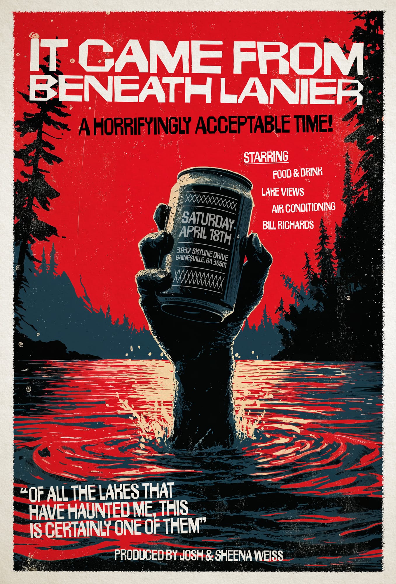
The second part of our east coast trip took us to Georgia. Last year I had pitched my friends on a lake house weekend and we finally got to do it. I of course …
May 4, 2026

Took an east coast trip with my family in April and made this invitation for the New York City leg of the trip. I wanted something that felt like the spring with some of …
May 4, 2026

And that's a wrap (for now) on the New York editions of Laugh Your Ads Off. Two more events and two more sell outs, the second of which was our largest session to date …
August 4, 2025
You must be logged in to post a comment.