Latest in: lettering
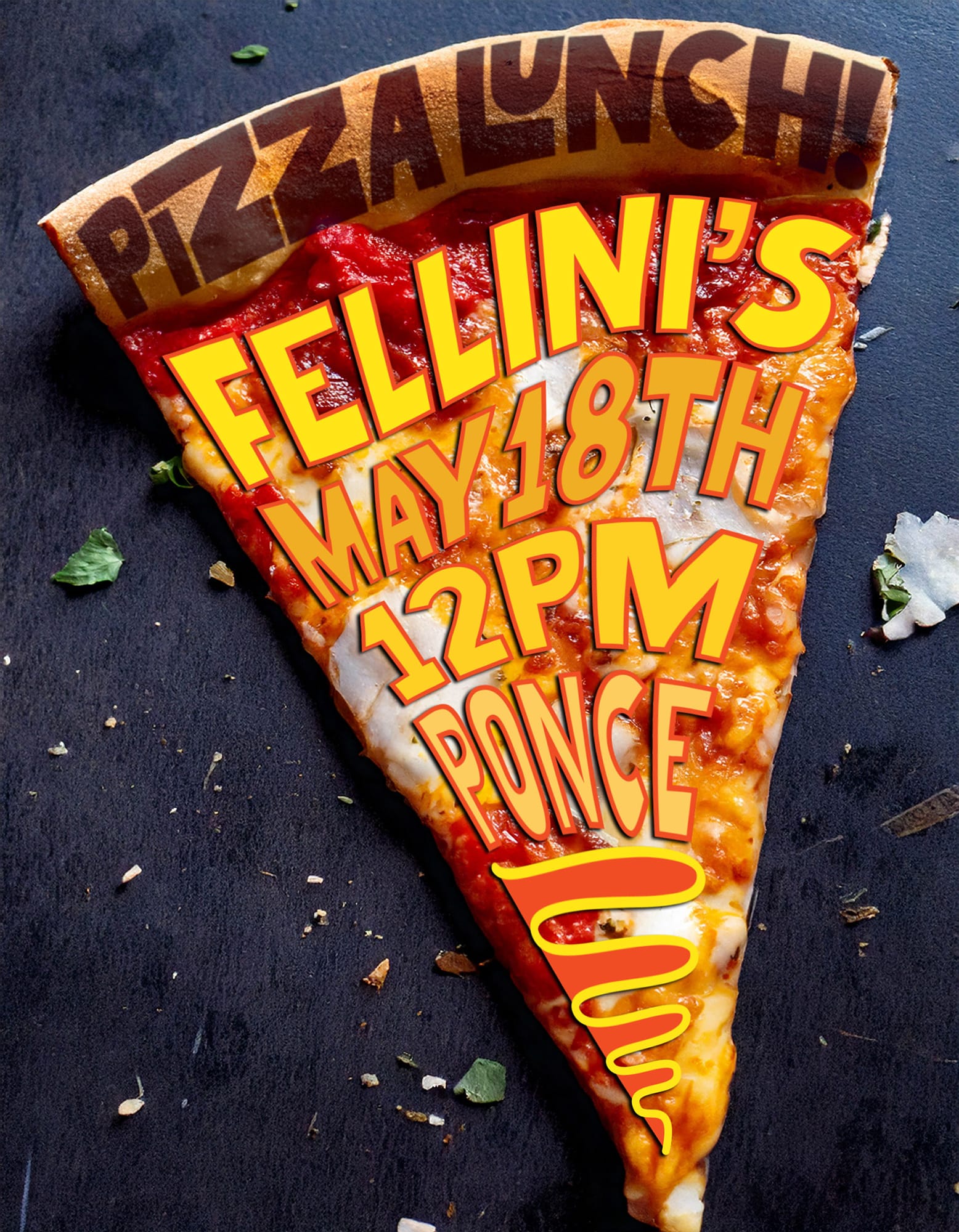
Every time I go back to Atlanta I get my friends together. At some point I started designing invites and realized I really enjoyed the opportunity. This was the one I made for my …
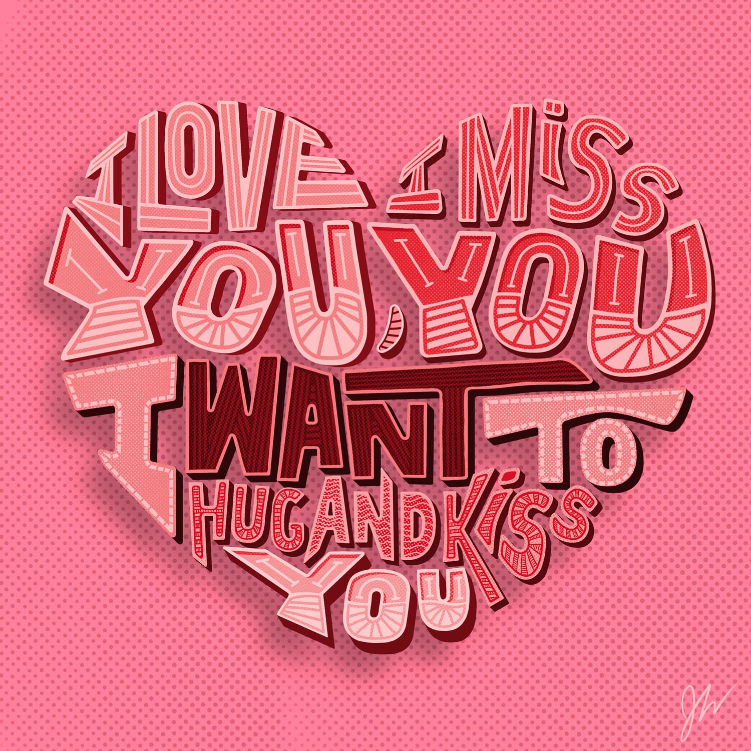
I was listening to a song by The Front Bottoms the other week and thought one of the lines would make a good typographic poster for Izzy. I did the initial layout in Illustrator …
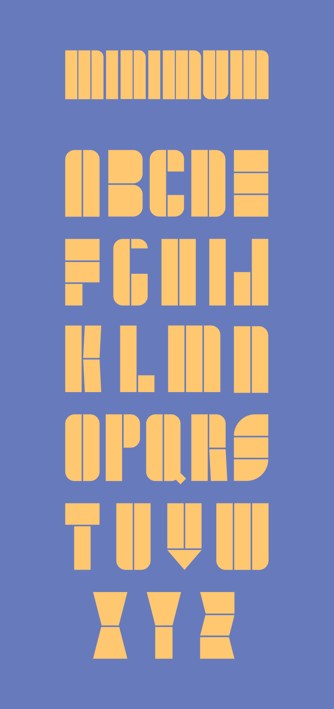
The other night I wanted to see if I could design a type face as minimally as possible. Starting with a base rectangle and seeing how I could distinguish each letterform with as few …
Over the past month I've been developing a pair of complementary fonts titled "Clothes" and "Clothes Sans." I wanted to do something that was completely hand drawn because It's an area that I know …
I was playing around with some new Procreate brushes and had some fun with an old Simpsons quotes last night. Here was the final result of that.
Just doing a little bit more lettering on my iPad because it had been awhile. Wanted to try combining a few different styles to see how it would come out. Not loving how the …
This phrase popped into my head the other week so I decided to make a lettering project out of it. Figuring out how to recreate the texture of a chicken nugget is just as …
I've been wanting to get more into lettering so I finally sat down with my iPad to give it a go. I used a lyric from one of my favorite bands, The World/Inferno Friendship …
Working with Sunita Deshpande, I helped create an illustrated alphabet book. Originally it was for my nephew's second birthday, but enough people wanted copies that we are producing a first edition on our own. …


You must be logged in to post a comment.