May 5, 2023

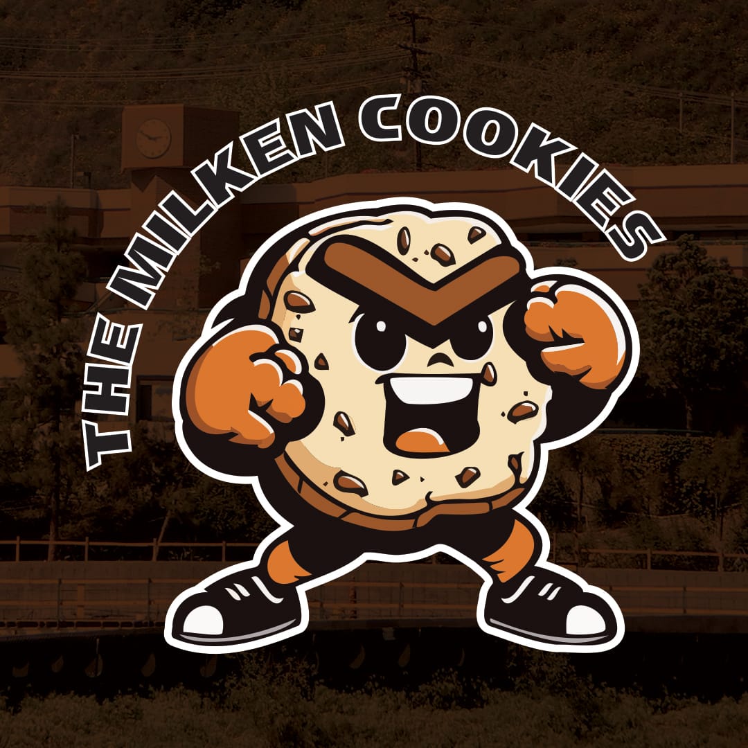
The Milken Cookies

While driving through the Sepulveda Pass in Los Angeles I noticed a school on my GPS called "The Milken Community School." Without any knowledge of the school I immediately imagined a new mascot for them, "The Milken Cookies." With the help of Midjourney, I designed their new mascot in the style of an NFL team logo. You can see the results below.

February 25, 2023

Black Coffee Creative

My friend Brittaney is a freelance writer for non-profits and needed a rebranding so I offered to develop a new logo for her. Her company is called "Black Coffee Creative" so I knew I needed to at minimum work in something coffee related for the mark. I ultimately settled on two coffee beans forming the shape of a heart to tie back to her desire to make the world a better place, it's a labor of love for her.

As for the font, I wanted something that felt bold, like black coffee. It needed personality and not something generic like a geometric san serif. The final touch was replacing the o in coffee with one of the beans to reinforce that design element. I also advised her on redesigning her website which she custom built on Squarespace.

The below is where we netted out. You can see her full website here.

September 9, 2020

MadWomen Podcast

The other month, my friend Sunita Deshpande asked if I could throw together a logo for her for a new podcast she was producing. The idea was to highlight the stories of anyone who wasn't part of the MadMen club (white males). As such, I threw this logo together for her to re-frame the classic MadMen falling man against the women who could take them down thanks to today's #MeToo movement.

The podcast will focus on the the stories these women and people of color have about abuse and mistreatment they received while working in the New York ad scene over the past 50 years.

May 20, 2020

Blu Jam Café

One of the restaurants near my place in Los Angeles is Blu Jam Café. The food is pretty good, but their branding sucks and I especially hate the logo.

So the other day while I was walking by I thought I might as well mock up a new logo for them. To the left is their current logo, and the right is my version. Ideally I'd make it out of actual blueberry jam and shoot it, but this will have to do for now.

April 27, 2020

Nuehuevo York

Last year I posted about how I had an idea for a restaurant name and made a logo for it. Well, over the past few days I decided to blow it out. That includes an identity suite, headlines/brand voice, in-restaurant design, social posts (with animation), a website and other collateral. See it here.

March 5, 2020

Jessica Garcia Shafer for School Board

The other week a friend of mine asked if I could help her with an impending run for school board. She wanted to play off her Mexican heritage, specifically Dia De Los Muertos. Obviously skulls were out of the question for a school board (or any political) run, so we decided to take cues from these little banners that get made. She also wanted to play off a pear flower, since it's for Pearland school board.

Here were some of the designs I came up with for her after studying real Dia De Los Muertos banners.


September 8, 2019

Nuehuevo York

Yesterday I had a dumb idea for a breakfast restaurant that would be based in New York City, so today I took a few minutes to mock up a logo for it. Decided on the color because of it's similarity to an egg yolk, obviously. And Picked Gotham for the font mainly for the obviousness of the New York connection.

July 11, 2019

Toyota PlayGround

As promised, I debuted my Toyota PlayGround project today. You can see the whole project by clicking here.

July 8, 2019

Sneak Peak

Currently working on two different projects, one has to stay hidden for now, but I can give a sneak peak of the second. It's something that's been floating around in my head for the past few years. Finally got the encouragement from someone to mock it up even though it never sold through.


June 21, 2019

Rebranding Exploration

A year and a half ago in an effort to modernize my portfolio I ditched the logo I'd been using since I was at Creative Circus. I went with something that was typography driven, but decided I missed having a mark I could truly own. A few months ago I started working on some explorations of what my new mark could be. I came up with the following 10 options.

In previous logo explorations, I always tried to incorporate my middle initial. It always proved challenging as J, D and W don't naturally fit together. This time I just said "fuck it" and ditched the D. Unsurprisingly, I was able to find a few parallel shapes between the J and the W. I also explored making custom mono-line fonts, but ultimately decided I wanted something that felt more organic.

I was really drawn to the three reversed calligraphic strokes that serve double duties for their similarity to a J and the fact that when positioned close together, they create a W.

After some feedback from a friend of mine, I ultimately created the following which is now scattered around the site and incorporated into my new resume design.